
Map 1: Western Region
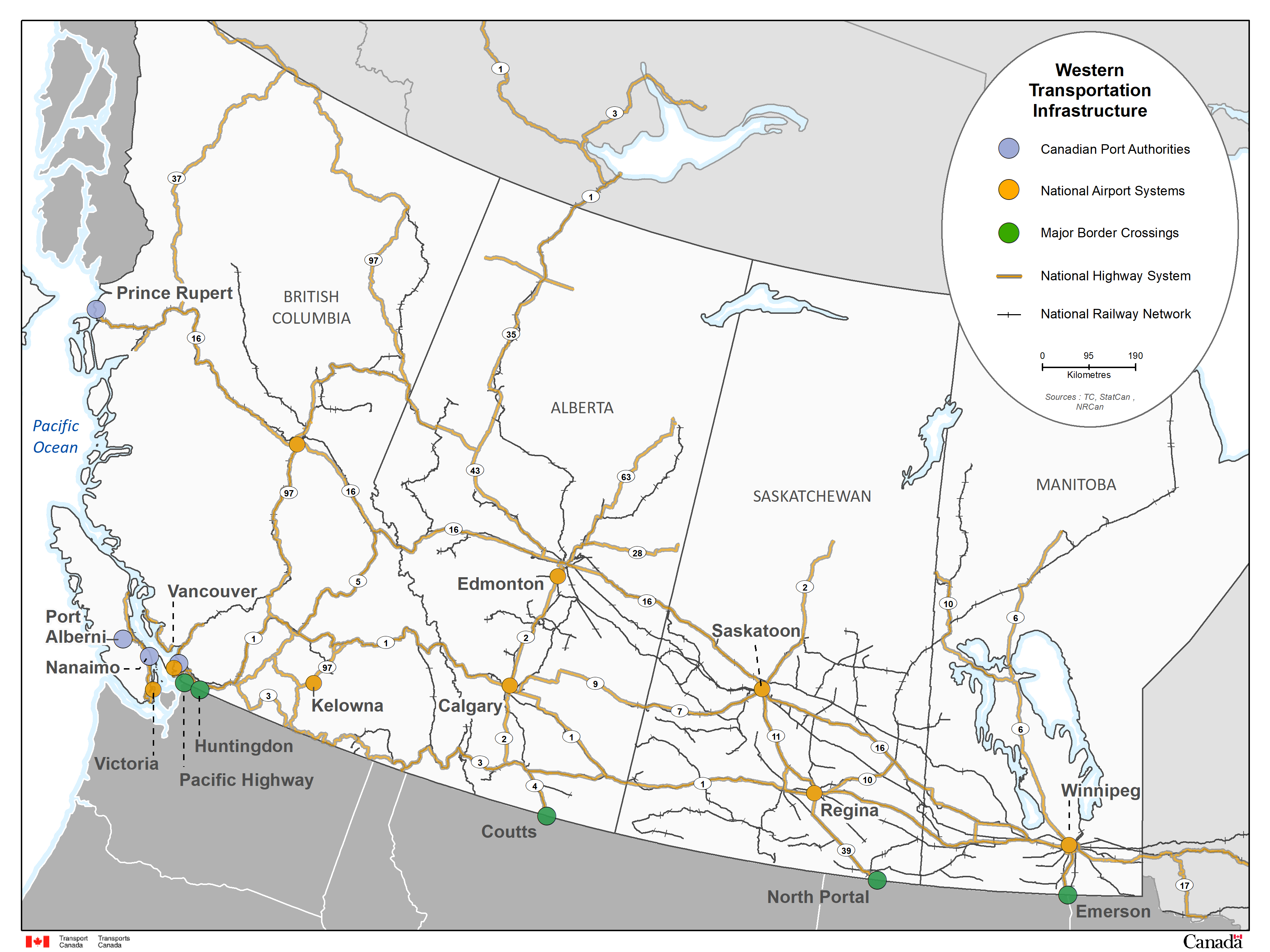
Image description - Map 1: Western Region
The map of the four Western provinces, British Columbia, Alberta, Saskatchewan and Manitoba, shows transportation infrastructure of the Western Region. NAS airports are identified geographically by an orange circle; six airports are located in the Prairie Provinces and three in British Columbia. CPA’s infrastructure is identified geographically by a blue circle; four of the 17 CPA are located in British Columbia. Border crossings are represented geographically by green circles. National Railway Network is represented by black lines and the National Highway System by brown lines.
Map 2: Central Region

Image description - Map 2: Central Region
The map of the two central provinces, Ontario and Quebec, shows transportation infrastructure of the Central Region. NAS airports are identified geographically by an orange circle; three airports are in Québec and four in Ontario. Ports are identified geographically by a blue circle; 9 out of the 17 CPA are located in the Central Region. Border crossings are identified geographically by green circles. National Railway Network is represented by black lines and National Highway System by brown lines.
Map 3: Eastern Region
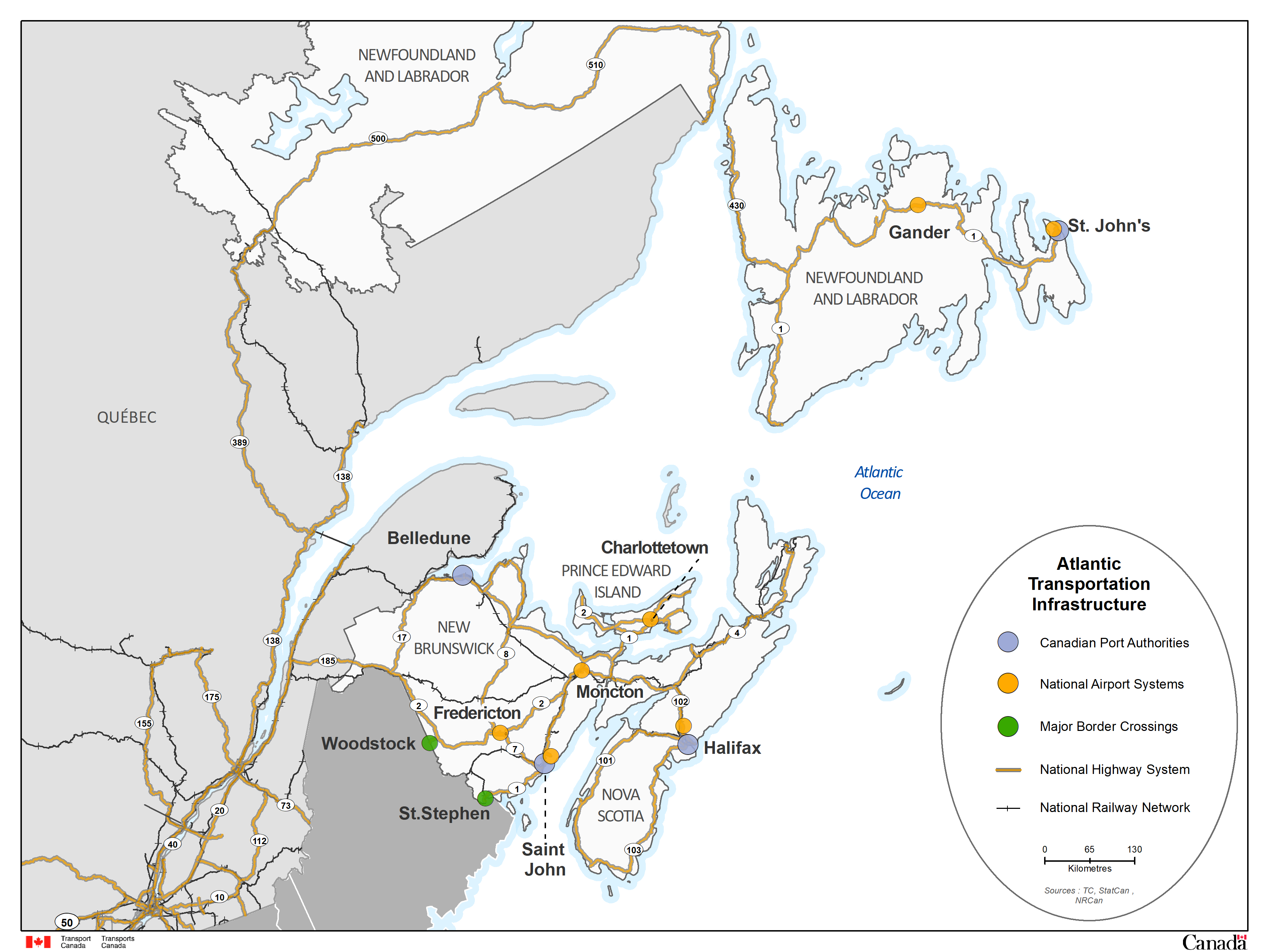
Image description - Map 3: Eastern Region
The map of the four Eastern provinces, New Brunswick, Nova Scotia, Prince Edward Island and Newfoundland and Labrador, shows transportation infrastructure of the Eastern Region. NAS airports are identified geographically by an orange circle; seven of these airports are located in the Atlantic Provinces. Ports are identified geographically by a blue circle; four out of the 17 CPA are located in Eastern Canada. Border crossings are represented geographically by green circles. National Railway Network is represented by black lines and National Highway System by brown lines.
Map 4: Northern Region
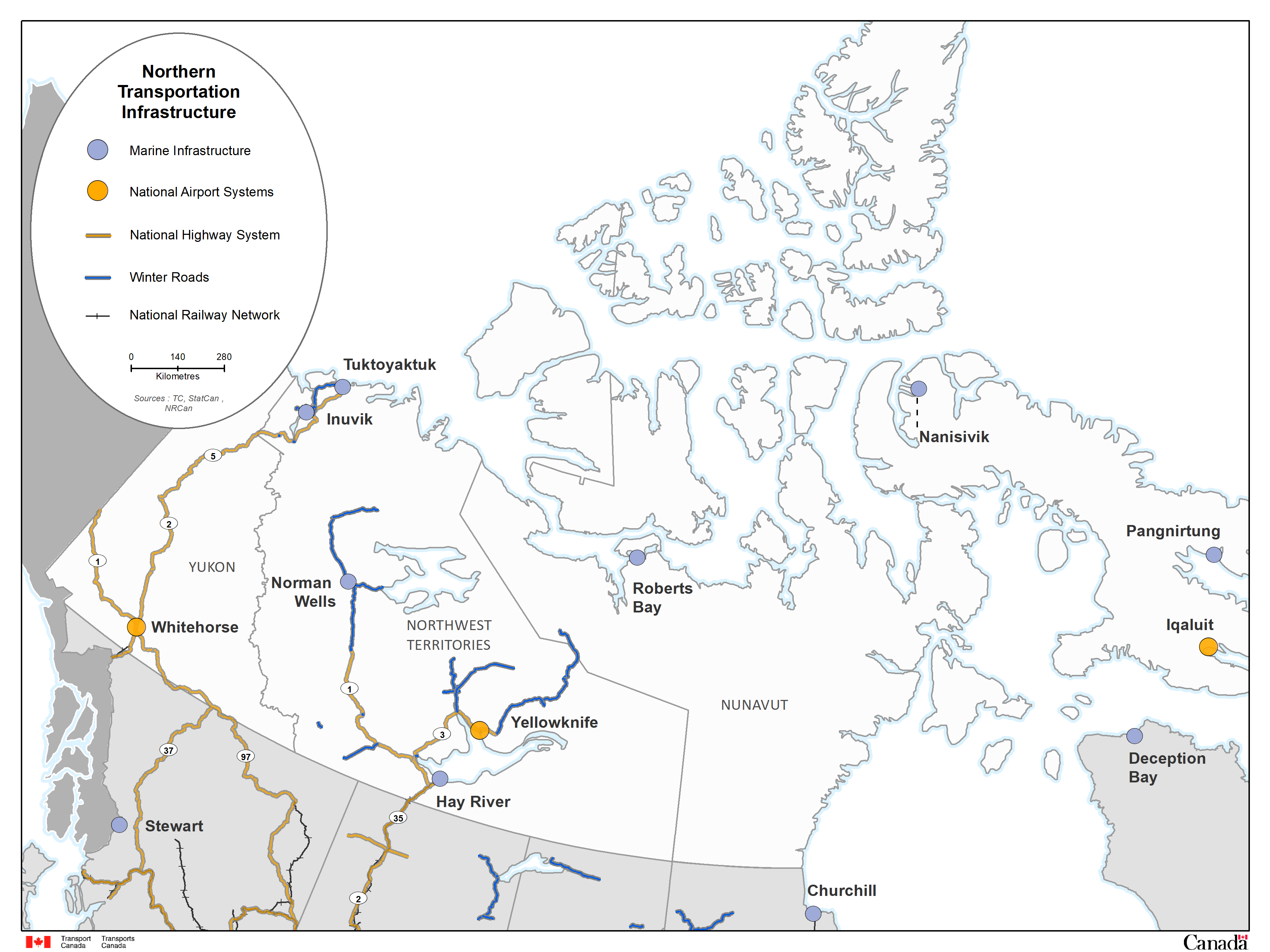
Image description - Map 4: Northern Region
The map of the three territories, Yukon, Northwest territories and Nunavut, shows transportation infrastructure of the Northern Region. NAS airports are identified geographically by an orange circle; three airports are found in the capital of each territory. Marine infrastructure is geographically represented by a blue circle. National Railway Network is represented by black lines and National Highway System by brown lines.
Map 5: Canadian Port Authorities
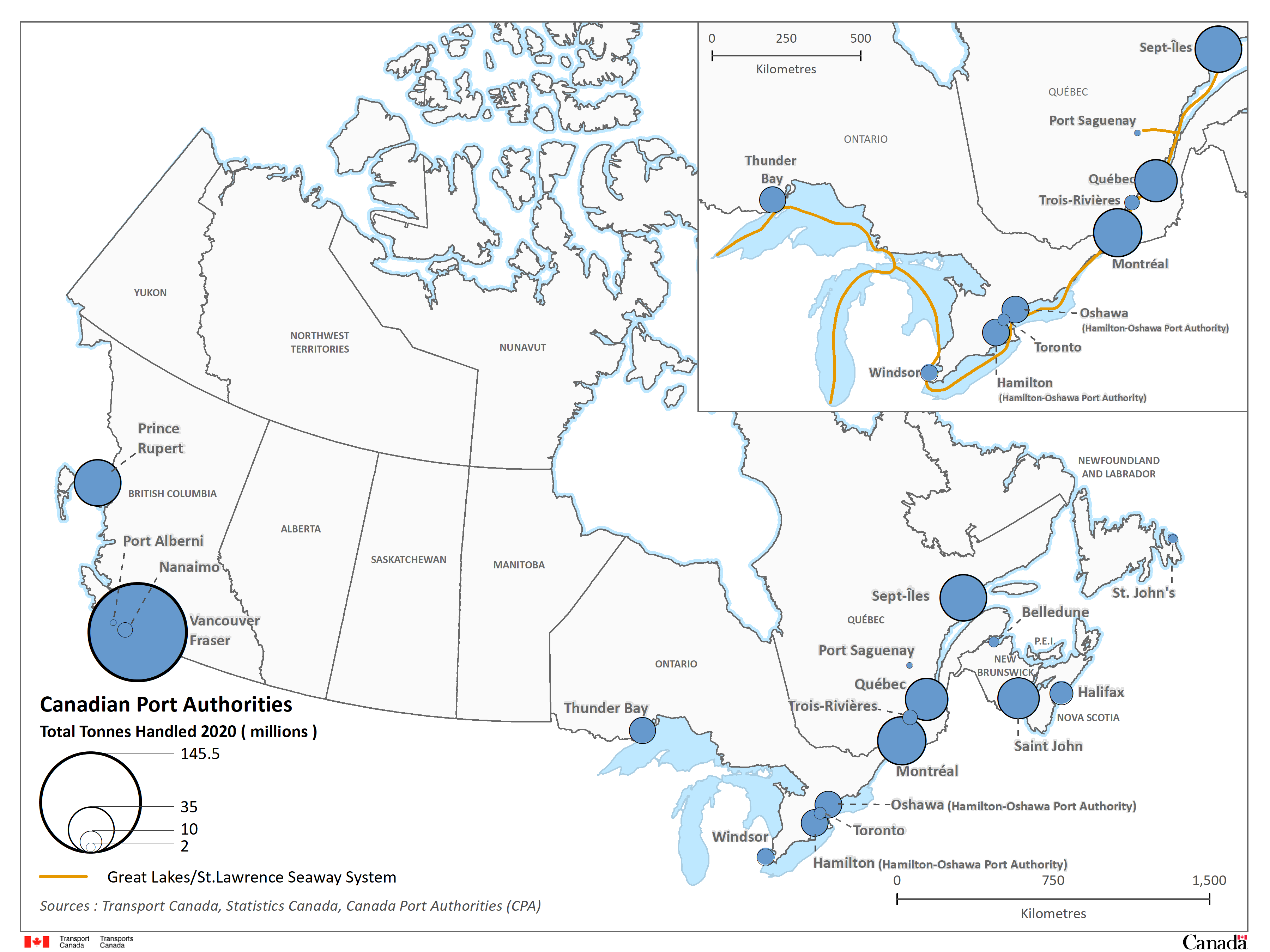
Image description - Map 5: Canadian Port Authorities
The map of Canada shows the geographical locations of the CPA infrastructure and provides information on the total tonnes handled by each port in 2020. Each port is represented on the map by a blue circle and is graduated in size proportional to the total tonnes handled. The highest total tonnes handled in 2020 was 145.5 million tonnes by Vancouver Fraser Port Authority.
An insert at the top right of the map shows the Great Lakes/St. Lawrence Seaway System (represented by an orange line). This system provides a strategic waterway into the North American Heartland and Overseas markets.
Sources: Transport Canada, Canada's Port Authorities
Map 6 - Rail system flow comparison, total traffic 2020 compared to 3 year average
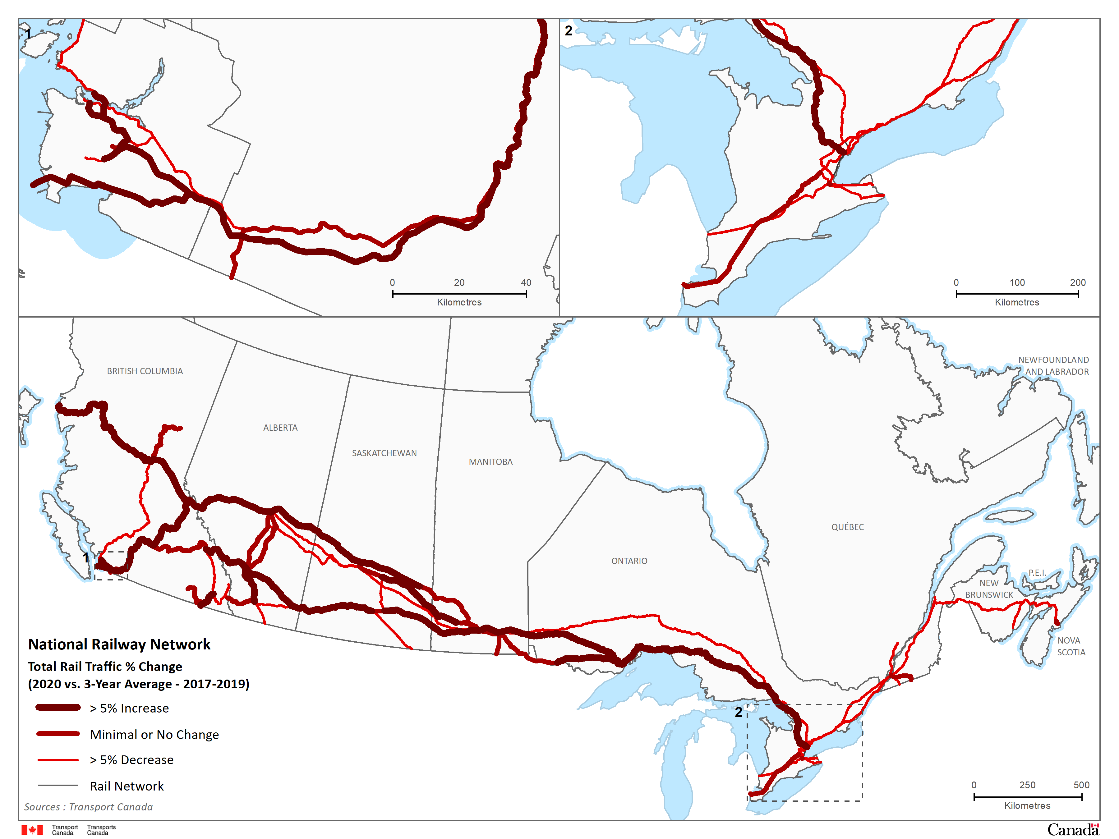
Image description - Map 6: Rail System Flow Comparison: Total Traffic 2020 Compared to 3 Year Average
The map shows the change in total rail traffic flow along Canada’s railway network in 2020 compared to the previous 3-year average.
Map 7 - Truck border crossing performance metrics, traffic flows
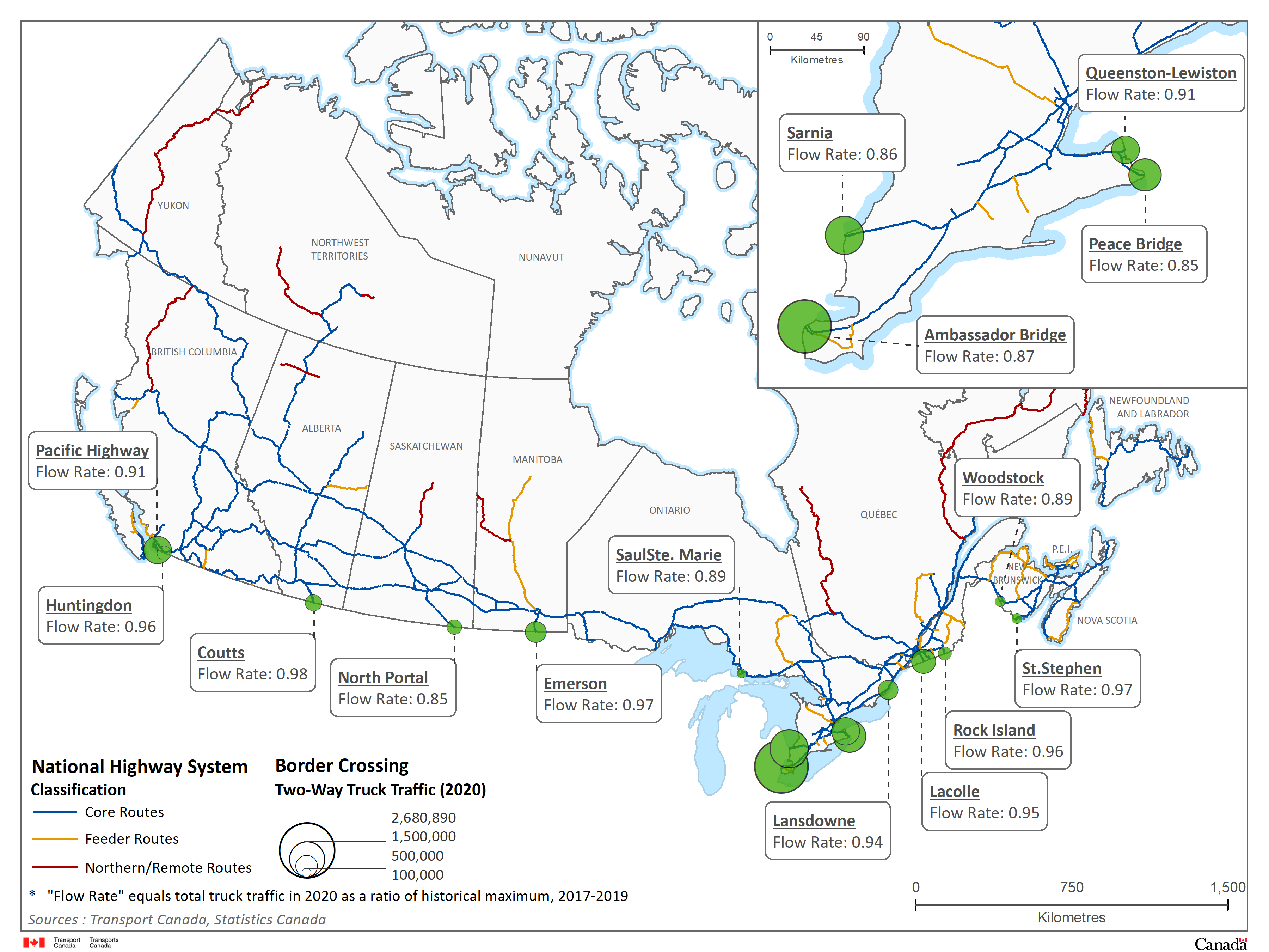
Image description - Map 7: Truck Border Crossing Performance Metrics: Traffic Flows
The map shows 15 major border crossings along the Canadian – U.S. border. At each border crossing, green circles are used to represent their location and are graduated in size to represent the amount of commercial two-way truck traffic handled in 2020.
Sources: Transport Canada, Statistics Canada
Note: Flow rate equals total truck traffic in 2020 as a ratio of historical maximum, 2017-2019
Map 8 - National Airport System

Image description - Map 8: National Airport System
The map of Canada shows the NAS airports as well as the amount of enplaned/deplaned revenue passengers for each airport. Each airport is identified geographically by an orange circle that also provides information on the enplaned/deplaned revenue passengers in 2020; the larger the circle the higher the number of enplaned/deplaned revenue passengers at this airport.
Sources: Transport Canada, Statistics Canada
Note: "N/A" values were represented cartographically by using a symbol smaller than used for Prince George - 0.5 millions of E/D revenue passengers